Analyzing MLB Attendance and Temperature
We started the project by cleaning and formatting our acquired data. This can all be found in the full Jupyter notebook. This includes adding some variables, converting formats (such as dates to Datetime), and other general cleanup.
Following this, we move on to exploratory data analysis. This phase consists of checking our data for outliers, looking for initial trends to inform hypotheses and potential model features, and gaining a better understanding of the data that we’re working with.
Macro Attendance EDA
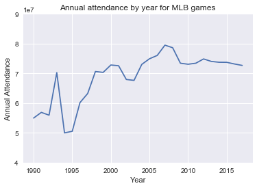
An easy place to start is to look at how overall attendance has trended over the length of the data collected. Indeed, the data shows that attendance peaked in 2007, after which there was a downward trend extending through 2017.

An interesting set of data points is seeing the activity in the early-mid 1990’s. Seeing these kinds of sharp gyrations in the data leads us to ask the natural question — what happened?
Further research shows that there was a strike that started in August 1994 and ran through early April, 1995. This cut out about a month and a half of games — and therefore potential attendance — and at the most crucial point in the season.
August and September attendance are in or near the top 3 for attendance per game per month, and for teams in playoff contention, it is likely in the top 3. So, the impact of not only missing a month and a half of a season, along with it being the most important months, is the predominant cause of the drop.

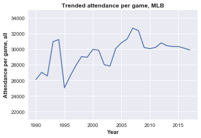
As a means to normalize for the different number of games, we can look at attendance per game, which shows that 1994 attendance was trending even higher than previous years before the stoppage. After the strike, there was a significant decrease in attendance, with the 1994 pre-strike level not being recovered until over a decade later.

Other factors
Now that we’ve confirmed the underlying trend that we’re looking to explain, we’ll spend some time looking at other related factors that will help us to further contextualize the data.
First, baseball has a reputation as being a slow-paced game, and this trend has been exacerbated over the past decade, with the average time per game increasing more than 10% since 2005. In a world that is exponentially speeding up, baseball is slowing down.

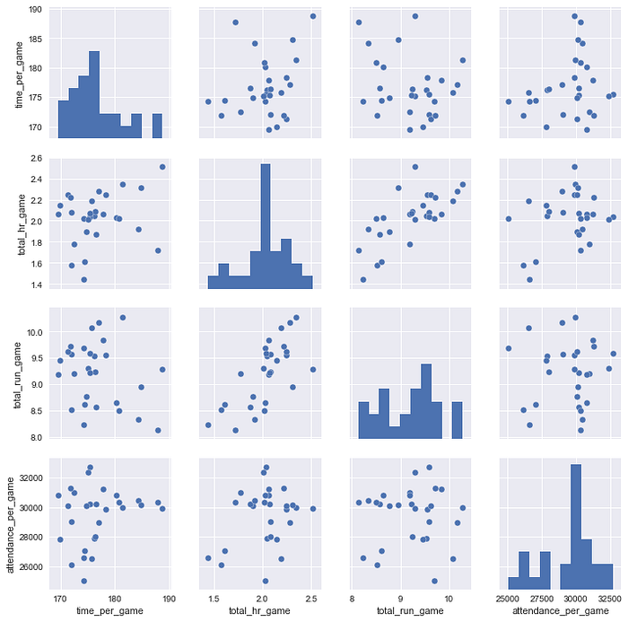
Next, we’ll start to look for some high-level indicators that correlate to attendance per game. Using a pairplot from Seaborn’s library is an efficient way to take multiple variables and have an immediate visual representation of both the variable itself as well as how it relates to the other variables.
Using annual aggregated variables for time (time per game), offensive excitement (homeruns per game), and offensive output (runs per game), let’s take a look at how these relate to attendance per game.

Naturally, total home runs per game and runs per game show the most linear pattern, but interestingly, when it comes to attendance per game, each of the variables show little correlation, even time per game, which was a bit surprising to me. In fact, while not a linear relationship, some of the higher attendance per game years came when the length of games were among the longest.
This doesn’t necessarily mean that these factors won’t be influential to our final analysis, just that there isn’t immediate validation of the initial hypotheses that offensive output or time per game would show a relationship with attendance.
Bringing it back to weather, we’ll begin to explore the intricacy of the relationship between Temperature and attendance per game. The scatter plot below plots the monthly average temperature in each city (x-axis) and the average monthly attendance per game for each team (y-axis). Overall, there are 30 (teams) x ~7 (months) for a little over 200 data points.

The result is a marginally positive correlation coefficient of 0.14, which certainly is not overwhelming evidence that there is a meaningful direct linear relationship between the two variables.
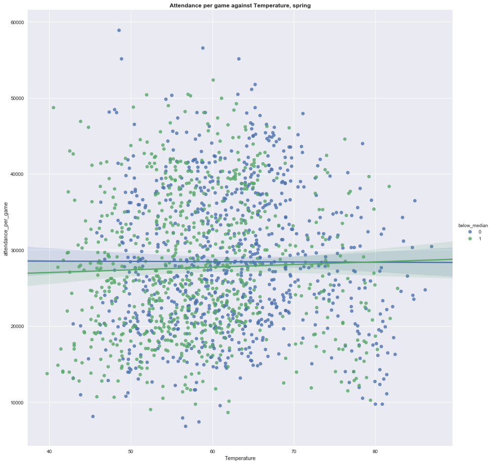
Further graphical attempts to investigate the relationship between weather and attendance, including isolating for colder months (April, May in the left graph below) and isolating for cold weather teams (less than 55 degrees Fahrenheit median temperature in April; right graph below) during those months showed no discernible relationship between the two variables.
(Note: In the plots below, when below_median = 1 (hue green), this indicates that the temperature in that month was below the median, and when the variable is 0 (hue blue), the value was equal to or above the median.)


The next step I’ll take in a following post is to attempt to create a model predicting attendance per game — I’m still very new at modeling, so it’ll be simple and feedback is welcome — as well as some deeper statistical analysis to determine the impact of Temperature, and other variables, against attendance.
